
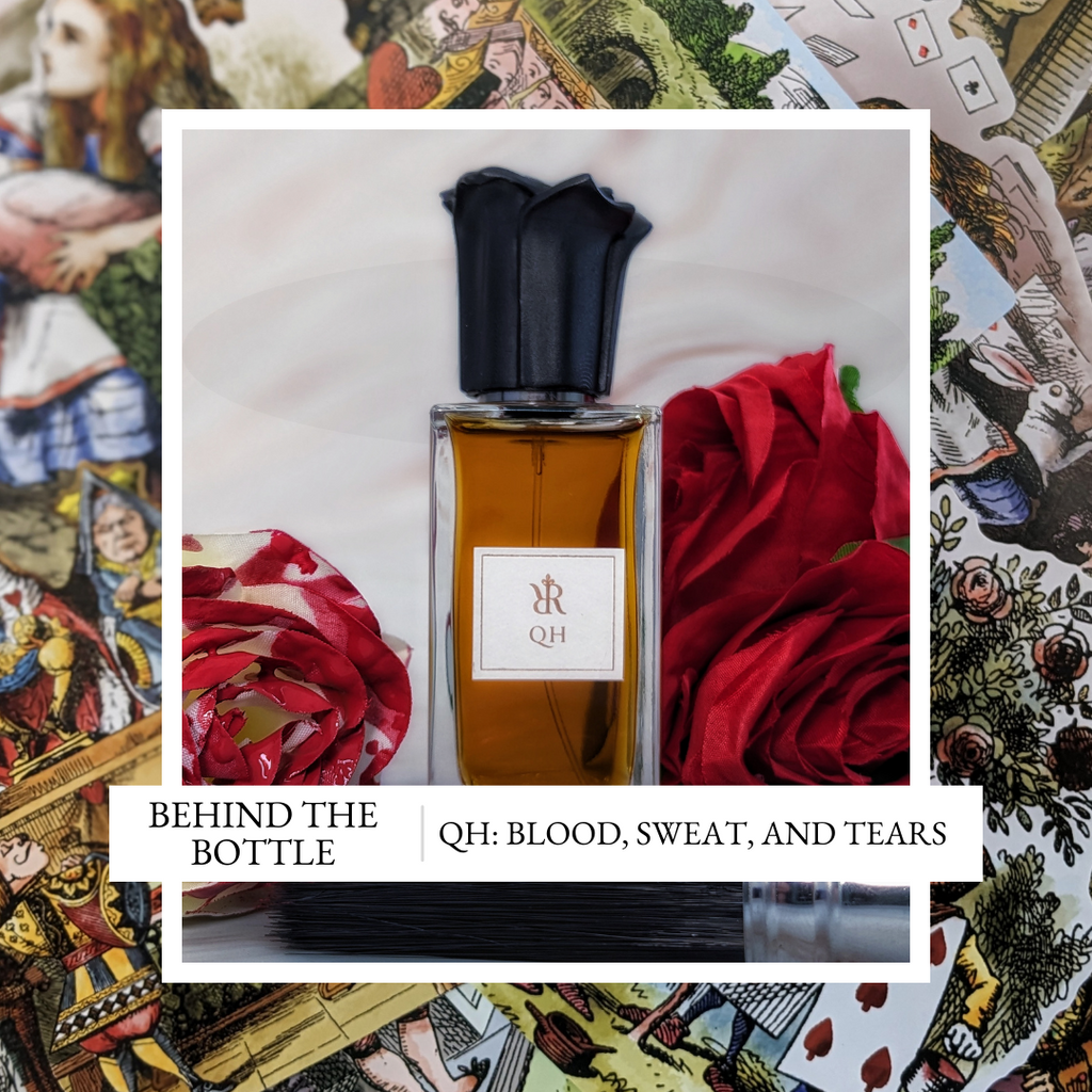
QH; Blood, Sweat, and Tears
The creation of QH has been one of my longest fought battles; a true test of patience, endurance, and a brilliant learning process. I’m of the opinion that if it is worth doing, it is worth doing well, so I’m ultimately pleased with where we ended up, and QH has become one of my own signature wears, but the first versions of QH existed way back some time in 2016/2017. So let’s look at how this adventure unfolded…
The Inspiration
I’ve known for a long time that I preferred the styling of our Queen of Hearts character as QH. I like short or single-word perfume names, I don’t know why. I also wanted to step away from gender biases; perfume is for everyone, and no matter how you identify, you should be able to enjoy it. QH feels more gender neutral while maintaining a clear link to the character’s roots.
Scouring Alice’s Adventures in Wonderland for inspiration, the Queen has many interesting descriptions. One that struck me that I played with for a long time were the regular references to “thunder” (in both character and manner). I ultimately moved away from this and took a more abstracted approach. Similarly, the Oud featured for a while, too – but the play between the fruity aspects of the rose and the oud never felt right.
Instead, I focussed on the essence and mood that I wanted to evoke: Vintage, yes. Regal, yes. Powerful and imposing, definitely! I also wanted to pull the “off with your head” aspect into the perfume too, both in a “when you smell it, it knocks your head off” but also by subverting the “top, middle, base” perfume structure and chopping off the top of the perfume pyramid, launching you straight into the spicy heart of the perfume. (‘Permission’ to break this ‘rule’ was given by Sarah McCartney at 4160Tuesdays when we started talking in 2016, which I admit was quite liberating.)
This is ultimately why I think the creative process took so long with QH; the lack of a ‘clear’ vision. Lots of concepts and ideas, but I didn’t have a clear picture in my head of how that all came together. At time,s each of the following avenues were followed: jam tarts, jammy roses, oud, spices (black pepper, pink pepper, saffron, cardamom, cinnamon – you name it!), thunderstorms, even a Shalimar-esque thing. They all make sense in a ‘creative cloud’, but turning that into a cohesive story that I could bottle, with the skills I had, wasn’t so easy. And so, QH was made, shelved for months (or maybe years), revisited, re-made, re-shelved, and so on.
The final iteration, which was ultimately released, was achieved partly by giving myself a strict deadline. This collection needed to happen, and QH was holding me back! I slimmed down the ‘creative cloud’ and focussed on some core aspects: “Off with your head”, spices, vintage/regal feel, and jammy roses.

Where this saga ultimately leads
The creative process
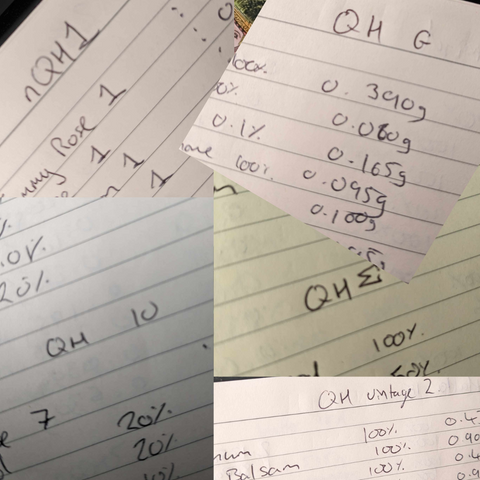
I number my versions: Hatter 1, Hatter 2, etc.
When I tell you that I lost count with QH several times over… (Usually after being shelved and revisited for a while)…
QH has had numbers, then Greek letters, then a combination of the two for versions of those versions (QH Beta 2, for example). That got too messy, so then it became nQH (new QH). One of these we will come back to (nQH1). Then it became QH Vintage. QH Vintage 2 was a promising version, but it wouldn’t pass regulations because of the Peru Balsam, and so the mod which became the QH we have today was QH Vintage 2 - Tolu Only... Remember how I said I like perfumes with short names?…
Without doubt, QH has had over 50 versions across various iterations and incarnations. There were undoubtedly a number of good ‘finished’ perfumes within that group, maybe even some that would have ‘fit the creative brief’, but for one reason or another, I wasn’t happy with them.
Endless variants (and naming conventions)...
Let’s take a quick detour to nQH1. 1 bottle of this exists in the world, a gift to my sister-in-law. It was a particularly dirty iteration of QH which leant into the “thunderous” side of the Queen. Still rosy, still spiced, potentially even before the Oud aspect was cut, too. What characterised it was a heavy dose of Geosmin to give a petrichor effect, and also made the whole composition quite earthy. Potentially more similar to when the gardeners in the story lay face-down in the rose beds at the Queen’s approach. I was happy with nQH1 for a while, it almost became “the” version, but over time I found it too dirty, and a bit too irritating. My sister-in-law, however, loved it (as did her mum). So, an unlabelled bottle (still with signature cap) sits on her dresser of this weird back-catalogue version of QH.
QH Vintage 2 – Tolu Only, or, more simply now, QH. This version was built with those core aspects in mind. A ‘jammy rose’, layering of spices, a vintage-feeling set of musks, all set upon a bed of resins for that opulence.
Finding the right rose was a challenge for a long time. I started with a natural rose oil, but was concerned about a couple of the allergens in there. Then, I moved to a lovely rose recreation, but it seemed to send things way too powdery, and didn’t have that rich Turkish-delight thickness that I was looking for. Then I discovered Rose Ultimate, and you know, because it has ultimate in the name, it has to be good, right? Rose Ultimate is a re-distillation of ‘spent’ rose petals, which results in a much thicker, jammier rose material, which is gloopy and red in colour. It was perfect.
I was able to double-down on the jammy-ness by supporting it with things like Davana (which also adds a nice boozy note), and a few other things. The rose itself is actually a very small part of the overall composition, but it plays together with a few other materials to give an amorphous red fruit and floral facet to the finished piece.
Spice wise, I stuck with black pepper or pink pepper (for fruitiness) for a while. But these are both quite ‘cold’ and pitchy spices to me. They didn’t work with the thick rose, and the layers of rich resins. It needed something warmer. That’s how I ended up moving to cardamom, cumin, and saffron. These felt warmer, and more in keeping with the textures and shape of the fragrance. (Without sounding completely mad, the peppers feel very ‘high pitched’ and scratchy, whereas these spices were more of a hum alongside the thickness of the fragrance).

Resins, and a mess
Resins abound: honestly, it is full of them. It is a nightmare to compound with all the thick, gloopy, textured things. Fir balsam, labdanum, oakmoss, to name a few. Fir balsam is the absolute worst of the lot to work with – it sets rock solid in the bottle, and sticks to everything that dares to look at it. It is a shame it is so beautiful – in QH it adds a bit of freshness with its pine-y-ness, and an incense type smoke to thicken the atmosphere even further. The big batch of QH which was made for the launch managed to destroy 3 spatulas during the compounding, and cause a tendon injury in my thumb from digging at the resins. QH: blood, sweat, and tears!
Bringing the perfume to life:
Choosing the signature paper for each perfume is a step which I unexpectedly quite enjoy. Rich, regal reds were a clear choice for QH. However, creative direction and practicality don’t always agree with each other. The boxes are printed with very dark blue ink for the name and product information. Dark blue on a dark red really wouldn’t work. Rather than falling back to a paper choice which didn’t feel right, I challenged my design partner (the wonderful Claire at Raven Red) and printing company for solutions. Lighter ink would have bled into the paper too much, particularly on the smaller point-sized text on the back, so we ended up going for a metallic ink, as it would sit atop the paper, rather than soaking in. The Queen, again, demanded special attention and an extra layer of opulence. So, while it doesn’t always show in the photos, QH has a bit of extra sparkle, born of a design challenge, but ultimately quite fitting for the story.

The finished packaging
For the cap, the design is simple, but well executed and effective. A rose. (Which, every time you uncap QH to wear it, you take it’s head off… Silly hidden puns…)
Part of the brief that I gave the designer, though, was to ‘sharpen’ the petals a little. These are not rounded, welcoming, voluptuous petals; they are sharp edged, with knife-like angles across their profiles. A cultivar which has adapted to survive in the Queen’s garden, a reflection of her.

A violent rose
So there we go, a years-long contest between a Queen, a creative vision, and a practical reality. As I said at the outset, I’m pleased with how the chapter ultimately concluded. I find myself in the company of QH quite a lot, and it is a bottle my partner reaches for often, too. Proof, I hope, that some things are worth persisting and fighting for! My hope is that you, too, enjoy your invitation to the royal court. Just be careful not to lose your head!
Leave a comment